- Home
Kashmir Nonpostals
½a Die
Plate ½a
Plate 1a
Plate ¼a
Plate 2as
4as Die
8as Die
Trials Table
Reprints Table
The Kashmir nonpostal production comprises a diverse range of material, from a unique essay of the first die to a deluge of reprints for the stamp market. A number of rare watercolors on European papers, presumed to be paper trials, may have been produced in the transition year 1877-78, though strictly they remain undated. This latter production largely recapitulates the color record of the postal material, i.e., ½a blacks, ½a blues and 1a oranges, ¼a black and 2as yellows, 4as greens, and 8as reds. A small number of oilcolor reprints did see real postal action in later years, and we have little option but to call them “postal non-postals.”
The ½a Single Die
Apart from a unique unfinished watercolor essay shown here below, there are no non-postals associated with the first Kashmir Single Die itself. The implement disappeared sufficiently early to be spared all the doings.

Unique Essay. This is the unique unfinished watercolor essay of the ½a single-die issue, a gem in the Hellrigl collection. The paper is coarse and diagonally-laid. Séfi & Mortimer report that this item had been found in the notebook of the engraver Rahat Ju, and it came into the hands of Captain Godfrey. The design of the issued stamp does evince a stage between this unfinished essay and that of the design seen in the first Kashmir plate. The leaf spandrels, for example, were turned first into simple squares at the single-die stage and then into dotted squares on said plate.
The Plate ½-anna
The ½a Watercolors: As to watercolor trials of the First Kashmir Plate, there was no nostalgic black in the ½a so far as is known (though the 1a counterpart does exist). The ½a, however, is represented by two blues, a ½a milky-blue watercolor on thick white meshed laid paper, and the following wove:
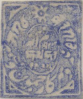
The ½a ‘blue’ watercolor on wove paper. A rarity in the Hellrigl collection, called by him an “experimental plate proof.” A blue is also recorded in the 1-anna denomination, but on the European laid paper.
The ½a Oilcolors: What follows is a token summoning of the ½a oilcolors from the first Kashmir plate. As with the Jammu plate productions, some of these may have been produced as trials during the transitional period and so would not be reprints properly so-called.


On horizontally striated native paper. Here, the ½a slate-blue and dull orange. A more regular orange is also attested in postally used condition (scan downscreen a bit). In addition to the two reds shown next, a black and a yellow-green are also attested on the native paper, both of which seem to be relatively scarce.
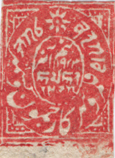

Above: Séfi lists only a ½a vermilion on the native paper, which matches the first item, but the other on the right, which might indeed be considered a dull version of the vermilion, still seems to us sufficiently distinct to merit its own place as some “red” of its own. Perhaps some of the effect is owing to the paper being of greyer hue.
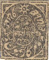
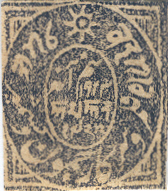
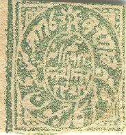

Wove papers: This quartet is a distinctive mottled printing on different thin coarse woves: the ½a black, a ½a deep bluish-grey, ½a green and the ½a blue-green.

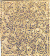
More toned wove papers, the ½a orange-red and pale dull blue, but with the printing not so distinctively mottled as in the first family, though the last is somewhat hybrid in that respect.

Another in the toned wove paper, the ½a brown-red, ex Haverbeck, who may have been responsible for all the marginal notations in ink that afflict many of the reprint multiples on partially-printed plates. Speaking of partially-printed plates, here is another:

The ½a olive-yellow on toned wove, ex Haverbeck. This item has a definite greenish cast in sunlight, and is rather more yellow than brown, whence our identification of it with the olive-yellow of the Séfi listing, not their ochre, which is the other possibility. The other toned woves in the list are pale yellow, deep bright blue, sage-green, green, and deep brown. The latter two are shown downscreen as anomalous postally-used examples.
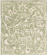

A family of two on the distinctive pure white meshed wove paper (very smooth), the ½a dull green and the ½a bright sage green.
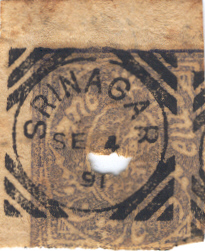
Apologies first for the hole in the stamp; we were fending off dagger-wielding zealots at the time. This variety may be the ½a pale dull blue on toned wove of the received list. The nonpostal cancellation with the fixed dating SE.4 91 is found not only among these old Kashmir reprints, but it also shows up on certain New Rectangulars, which one supposes was remaindered stock.


Details of postally used reprints taken from two similar and authentic registered covers mailed from the British Office at Srinagar on 21 July 1892. The addressee was “His Highness The Prince Christian Victor of Schleswig-Holstein, GER, King’s Royal Rifles, Ghora Dakka Murree.” Murree was the summer capital of the British Raj in Punjab. In April 1892 the Isazai Field Force battalion was split up, with the HQ and four companies at Ghora Dhaka in the Murree Hills. The upper detail has the visitor’s plate 2as pale yellow on native paper accompanied by a pair of ½a Kashmir plate reprints in green and (dark) brown on thin wove paper (and 3 × 1a brown-purple in Victorias). The lower detail has the same denominations in the reprints but the papers are reversed: the visitor’s plate 2as black on native paper (not slate-black on wove paper), accompanied by a pair of ½a Kashmir reprints in orange on native paper (with 2 × 1a in Victorias and a ¼a orange New Rectangular re-issue not shown). Other covers in the same family bear circular reprints. Details from Harmers London March 2012 auction catalogue (the Mortimer reference collection of forgeries). Here is Mortimer’s commentary:
“Postmarked reprints. Many reprints are found with postmarks and obliterations from both forged and genuine dies. Two interesting covers from the Séfi collection show the “favour” accorded by postal officials. The covers are each franked with three Imperial 1a stamps obliterated with the large barred-L of Srinagar, and each, also, with 3-annas’ worth of Kashmir reprints cancelled with the 3-circle (genuine) postmarks of Srinagar dated 21st July 1892. Unfortunately the barred-L obliterator ceased to be used in 1890, while the obliging official also overlooked the fact that both covers were dated at the back in the native vernacular in manuscript, one with 1885 and the other with 1887! Both covers had originally been addressed to His Highness Prince Christian Victor of Schleswig-Holstein at Murree. It is no doubt from covers of this description that the belief in reprints having been available for postage originated.”
Anthony Bard understands these to be authentic covers, not forgeries. The barred-L obliterator of the type was indeed used legitimately after 1890 on registered mail. The wayward ‘datings’ 1885 and 1887, were not datings, but rather registration numbers.
The Plate 1-anna
The 1a Watercolors: As to watercolor trials from the lower strip of the First Composite Plate there are mentioned the 1a black and 1a blue watercolors on European laid paper. We recall that the 1a was also done in blue in the early watercolor period when the entire plate was done in a single color. The others, true to the parallelism of the older postal record, are in colors that might be said to belong to a 1a ‘orange’ family. While they start off in oranges of decidedly browny persuasion (‘chestnuts’), they do come truer to form in a 1a orange-red on both European laid and wove papers, and finally in a proper 1a orange on a thin pelure wove.


The 1a chestnut [?] watercolor on sturdy wove paper, position #2 in the strip, from the Lunn Collection. The item in the grey-scale reproduction is of the 1a chestnut watercolor on thick European laid paper. The image is taken from the Haverbeck auction catalogue Lot 1399. By the way, the stamp is position #2 of the strip, not #4 as recorded.

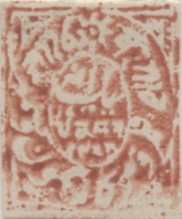
On left, a 1a watercolor on bâtonné, ex Séfi [unique?] On right, another 1a on vertically laid paper, both rarities in the Hellrigl collection. We do not try to name the colors, or try to force an identification with the received list in the trials table downscreen. As to which, if any, of these scans would have been called “chestnut” by the chestnut namer, we do not know.
The thin pelure woves listed in the trials table are said to be almost translucent, easily revealing the printing impression through it. Staal p.145, following Haverbeck, following Moëns, chronicle a 1a yellowish brick-red watercolor on white laid paper having particularly broad laiding lines.
The 1a Oilcolors: The 1a plate strips that follow are sometimes called “proof strips” in the literature (e.g., the Haverbeck Sale). On this site, proofs are understood to be preliminary productions executed from an approved plate or die before an issue has first been made available for postal use. Since the productions shown below, whatever their dating, appeared many years after the plates came into postal use, we do not use the term ‘proofs’. After some waffling on these pages, we finally come down on the side of those who consider these to be reprints proper, not 1878 experimental productions. There are shade and paper features that suggest post-1883 dating. Various rumors repeat an 1886 dating for reasons here not known.

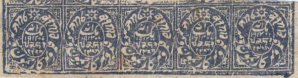

Native paper 1a oilcolor strips in the black, bright bluish-grey and dull orange. Such is also attested in a yellow-green, which seems to be much scarcer. We do not know whether it is known in strip form.
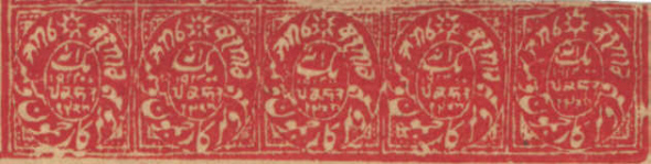
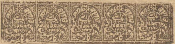
Wove paper 1a oilcolor strips in the vermilion and brown. We have seen no others in strip form in the wove paper, just singles, such as:
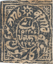
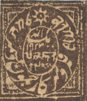

There are two blues on wove paper in the Séfi list, a 1a deep blue and a 1a grey blue. Until we can see the other, let us refrain from guessing which one the sample on the upper-left might be. The 1a dark brown or chocolate might be added to the listing as a shade of the other browns. The mottled monster would seem to come nicely under the list’s 1a brown-red. Another black and a yellow-green are known in the wove as well.

The 1a brown-black (or grey-brown?) oilcolor on wove paper (position #2 in the strip) overprinted CANCELLED in red. Lunn Collection.
The Plate ¼-anna
 As to the representatives for the Second, or Visitors’, plate, the item in the
corner is a grey-scale reproduction of the ¼a black
watercolor on very thin pelure paper (the famed 1877 ‘onionskin’)
offered in the Haverbeck auction Lot 1394, from which this illustration was taken.
The Haverbeck Sale Lot 1393 is also pertinent here: a claim of the only known copies
outside the Tapling Collection of the pelure woves with rose tinting. Along with
counterparts in the 4as and 8as, these were conjectured by Séfi and Mortimer to
have been early die proofs of the original issues, 1867. We are free to doubt
the use of such paper so early, especially given the existence of other pelures ascribed to
the transitional period.
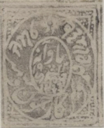
The ¼a grey-black watercolor on thin untinted pelure wove. Collection Hellrigl. A counterpart exists (scan downscreen) on the same paper in the 2as yellow.
The ¼a Ink Trials: Strips of the upper row of the Visitors’s plate in black and grey-black ink on European laid batonné paper are found in State I of the plate, i.e, no rivet impressions along their lower edge. These strips are often (and confusingly) called ‘proof strips’ in the literature, terminology which does not accord with one definition of proof that would here relegate any such to 1867 or before, when the plate first came into use. The first notice of these ink productions in Europe was January 1879. It is not known whether they are pre-May 1878 ink trials or are post-May 1878 reprints, when the plate was no longer used for official postal stamp production. Technically, they could be both: ink experimentation after May; nothing of significance hinges on this detail, but we pedants like to have our taxonomies in order.


Apart from the variation in ink thickness, these items also seem to come in only a few distinct impression varieties, a fact that suggests that their number is decidedly limited. One type (first strip above) is characterized by the absence of ink along the lower-left border; in the other common type this deficiency is more than compensated for, with some of the 2as portion of the plate showing, ghost-fashion as in the second strip. A properly printed type is also reported.
While we have seen specimens with approximate horizontal laiding only, there are reports of vertical laiding as well. The papers vary in thickness, tone, texture, and laiding line-separation. The first strip shown above is a has a uniform thickness of about 0.09 mm, while the second strip is significantly thinner, varying over the 0.04-0.05 mm range. Some specimens are rather white. The batonné rulings in both specimens shown here are separated by about a stamp width. The item is also reported in a coarse wove. Eames reports copies of the ½a circular in the same ink, which usually show an embossed effect.
The ¼a Blue Ink: A ¼a blue printers’ ink on thick wove paper is reported by Tim Eames. It bears a cancel consisting of three concentric circles of different thicknesses. An impression in the same blue ink of the outer frame of the ¼a New Rectangular plate is found offset on the back.
The ¼a Oilcolors: The Visitors’s plate suffered major surgery at some unknown time after spring 1881 when all the printing implements were taking rivet cures. In this case, four rivets (no half-measures here) were driven into the plate along the line separating the ¼a subjects in the upper row from the 2as subjects in the lower, thus making for State II of the plate. This latter material makes for uncontroversial reprints. They are often ascribed to the 1886-88 period, reasons here unknown, apart from the fact that Séfi and Mortimer said so. We also use their shade terminology for the six basic color types known among the reprints.


On left: The ¼a lilac oilcolor early nonpostal, pre-repair condition. The upper row containing these ¼a types were printed simultaneously with the 2as types in the lower row. The scan here shows the mottled demeanor of some of them. On right: The ¼a lilac oilcolor reprint on native paper, i.e., post-repair condition. Rivet impression can be seen on both lower corners, the one on the left dark, the one on the right albino.
The Plate 2-anna


Left: The 2as yellow watercolors on thin untinted pelure wove. Collection Hellrigl. A counterpart exists (scan upscreen) on the same paper in the ¼a grey-black. On right: The 2as yellow on thin horizontally laid paper, position #3 in the strip. Status unclear: Despite its watery demeanor, the pigment does not pick-up in the familiar way in a water test.
The 2as Oilcolors: The lower strip of the plate is known in oilcolor productions in two plate states, pre- and post-repair. The latter are characterized by the rivet impressions that appear along the upper edge.

Pre-repair condition: The 2as lilac oilcolor nonpostal on native paper, horizontal striations, in a partial strip (first subject missing). Dating perhaps 1881. This type is usually referred to as “the early reprint” as no other colors are known with the plate in this condition. They are rather scarce. In the scan above, any rivet impressions along the upper edge would be visible were they present.
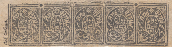

The 2as slate-black and black oilcolor reprint strips on horizontally striated native paper, ex Haverbeck. A postally-used copy of the latter can be seen in the detail upscreen. It would seem not to be “slate-black on wove” paper that is given for it in the auction catalogue, for such is not attested.
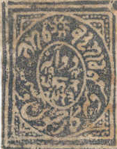

The 2as slate-blue and pale yellow oilcolor on native paper. A postally-used copy of the latter can be seen in the detail upscreen.
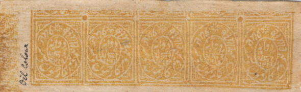
The 2as pale yellow oilcolor reprint strip on horizontally striated native paper, ex Haverbeck. In daylight there is a shade difference between this strip, which has an orange cast, and the single shown in the preceding line, which is of more lemony flavor.
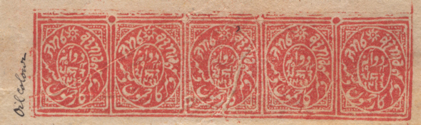

The 2as vermilion (upper strip) and orange-red oilcolors on native paper, ex Haverbeck. Unfortunately the vermilion strip is rather mutilated. Full strips are rare.
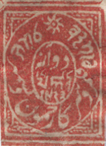

Deeper shades of, we suppose, the vermillion? It is sufficiently different that an addition to the reprint list might be warranted. (We dare to do that in the table at the bottom of the screen and call this type the 2as red, native papers both.) The copy with the nonpostal cancellation (stamp upside-down) shows the fixed dating SE.4 91, which is also to be found with the ½a first Kashmir plate reprints and other fare sometimes deemed cancelled-to-order rather than something more deeply spurious.
The 4as Single Die
As to the representatives of the 4as die, there is another black on the thin, pale rose-tinted pelure paper, which has counterparts in the 8as die and both strips of the Visitors’ plate. Séfi and Mortimer, in spite of the paper, take these blacks to be early proofs for the original issues, 1867. The 4as emerald-green trials are reported in a range of shades and papers. The Haverbeck catalogue refers to a example on the white laid paper as ‘sea green,’ called vert d’eau in Staal p 145. A paler version comes in a white pelure wove. Ref: T. Eames India Post 29 128 (1995).


Above left: The 4as yellow-green oilcolor on horizontally laid paper. Example right: The 4as emerald watercolor on laid paper, dating for both unknown, but presumably of the 1877-78 period. Collection Hellrigl.
A 4as yellow-green oilcolor on horizontally laid paper is chronicled, rare. It is assumed to belong to the transitional experiments of 1878.
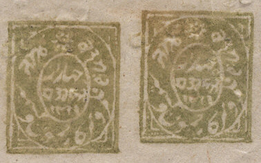
A 4as yellow-green reprint pair on a waxy-surfaced native paper.
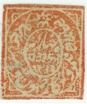
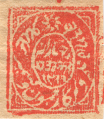
A 4as orange reprint on native paper and a 4as orange-vermilion reprint on toned wove paper.
The 8as Single Die
 As to the representatives of the 8as die,
the item in the corner is a grey-scale reproduction of the
8as brick-red watercolor on thick white horizontally laid paper. The
image is taken from the Haverbeck catalogue, Lot 1402.
Garratt-Adams (Staal p 110) reports a postally used copy (struck with the 5/L-6 British
Srinagar obliterator) having very broad laiding lines. The 8as black
on rose-tinted pelure
has counterparts in the 4as die and both values of the Visitors’ plate. Séfi and
Mortimer, in spite of the paper, take these blacks to be early proofs for the original
issues, 1867. As to the 4as brick-red on thin white pelure wove of the
table below, we must make reference to the ‘bright red’ of Haverbeck Lot
1410. We do not know if the two are the same thing.
A varied class of non-postals come in a distinctive brick-red oilcolor pigment, including the circulars (on native paper) in all three denominations.
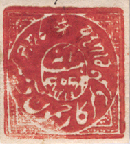
The 8as brick-red oilcolor on white vertically laid paper, and partially gummed. Séfi chronicles such for 1878, though makes no mention of gumming. They are sometimes referred to in the literature as “die proofs,” terminology that we don’t use on account of the late date.
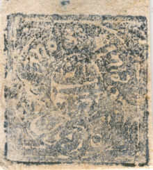
The 8as deep indigo oilcolor or insoluble ink on a fibrous wove paper. Another pleasant if alien piece brought to notice by Mr. Lunn. A masking reveals the design to be accurate, allowing for the bounce artifact on the right edge. There are a number of tiny pin-holes in the upper-center of the stamp, which is at least conceivably in evidence of period provenance, for we hear tell that some early stamp dealers used to pin their wares on the walls of their shops.

The 8as reprints on native paper. The 8as black is the only one we can show, and it also exists in the wove paper. Séfi & Mortimer chronicle two others in red on native paper, a deep red and an orange-vermilion.
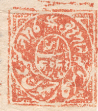
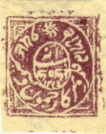
The 8as reprints on wove papers. While Séfi speaks of a dull orange and a vermilion on toned wove papers, the example on the left above is is something of both and neither, and is on an almost white paper. It is certainly not like the other dull oranges in the reprints list in the other denominations (including circulars). As to the other, the received listing does mention a purple on toned wove, but nothing about the yellow hypertoning we see here. As mentioned, a black on toned wove also exists, as does an ochre, which we have never seen. It might be scarce.
Watercolor Paper Trials
| 1a black | laid (½a unattested) |
| ¼a black | thin pelure ‘onionskin’ wove |
| ¼a black | thin pelure wove |
| ¼a black | rose-tinted pelure wove |
| 2as black | rose-tinted pelure wove |
| 4as black | thin pale rose-tinted pelure wove |
| 8as black | thin pale rose-tinted pelure wove |
| ½a milky-blue | thick white meshed laid |
| ½a blue | wove (Hellrigl) |
| 1a blue | meshed laid |
| 1a yellowish brick-red | white laid |
| 8as brick-red | thick white horizontal laid |
| 8as brick-red | thin white pelure wove |
| 8as ‘red’ | wove, pin-perforated (unique) |
| 1a chestnut | thick white laid |
| 1a chestnut | thin wove bâtonné |
| 1a chestnut? | sturdy wove (Lunn) |
| 1a orange-red | wove |
| 1a orange-red | laid |
| 1a orange | thin pelure wove |
| 2as yellow | thin pelure wove |
| 2as yellow (water?) | thin laid |
| 4as yellow-green | thick white laid |
| 4as emerald-green | thick white laid |
| 4as emerald-green | white pelure wove |
Reprints Table
This information is taken from Séfi & Mortimer. The early lilac printings of the Visitor’s plate are not included because those are the only representatives from that plate. The 2as entries below are all State II of the plate. It is not obvious that the rare State I versions in lilac are reprints proper in any case. The abbreviations we have used are:
| n = native paper | t = toned wove[s] | w = white wove | m = meshed wove |
| Color | ½a | 1a | 2as | 4as | 8as |
| black | n,t | n,t | n | n,t | n,t |
| slate-black | — | — | n | — | — |
| brown-black | — | t | — | — | — |
| slate-blue | n | — | n | — | — |
| deep bluish-grey | t | — | — | — | — |
| bright bluish-grey | — | n | — | — | — |
| deep blue | — | t | — | — | — |
| grey blue | — | t | — | — | — |
| pale dull blue | t | — | — | — | — |
| deep bright blue | t | — | — | — | — |
| blue | — | — | — | n | — |
| dull blue | — | — | — | t,w | — |
| ‘red’ | n | — | n | — | — |
| deep red | — | — | — | — | n |
| vermilion | n | t | n | — | t |
| orange-vermilion | — | — | — | t | n |
| orange-red | t | — | n | — | — |
| brown-red | t | t | — | t | — |
| orange | n | — | — | n,w | — |
| dull orange | n | n | — | — | t |
| pale yellow | t | — | n | — | — |
| olive-yellow | t | — | — | — | — |
| ochre | t | — | — | t | t |
| yellow-green | n | n,t | — | n,t | — |
| sage-green | t | — | — | — | — |
| bright sage-green | m | — | — | — | — |
| blue-green | t | — | — | — | — |
| green | t | — | — | — | — |
| dull green | m | — | — | — | — |
| purple | — | — | — | n,t,w | t |
| brown | — | t | — | — | — |
| deep brown | t | t | — | — | — |